The Nap Ministry
Brand Identity / Social Media Design / Merch
About
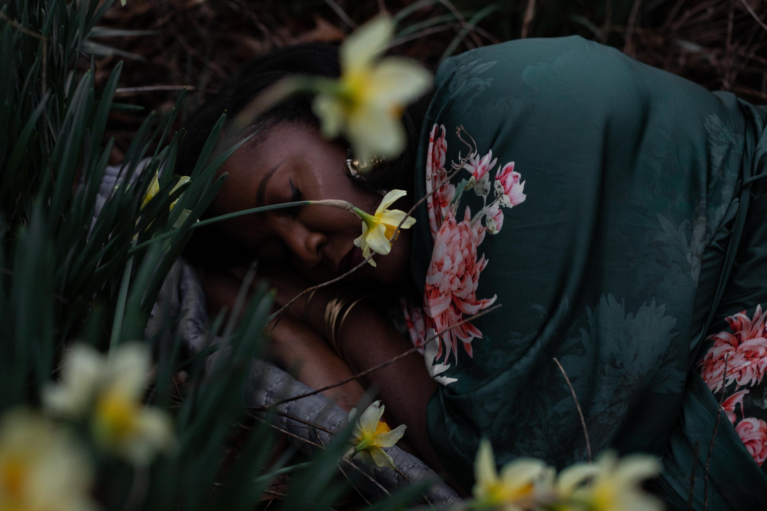
The Nap Ministry the originator of the ‘rest as resistance’ and ‘rest as reparations’ frameworks, and create sacred spaces where the liberatory, restorative, and disruptive power of rest can take hold. Our work is seeded within the soils of Black radical thought, somatics, Afrofuturism, womanism, and liberation theology, and is a guide for how to collectively deprogram, decolonize, and unravel ourselves from the wreckage of capitalism and white supremacy. We believe our bodies are portals. They are sites of liberation, knowledge, and invention that are waiting to be reclaimed and awakened by the beautiful interruptions of brutal systems that sleep and dreaming provide.
Our Solve
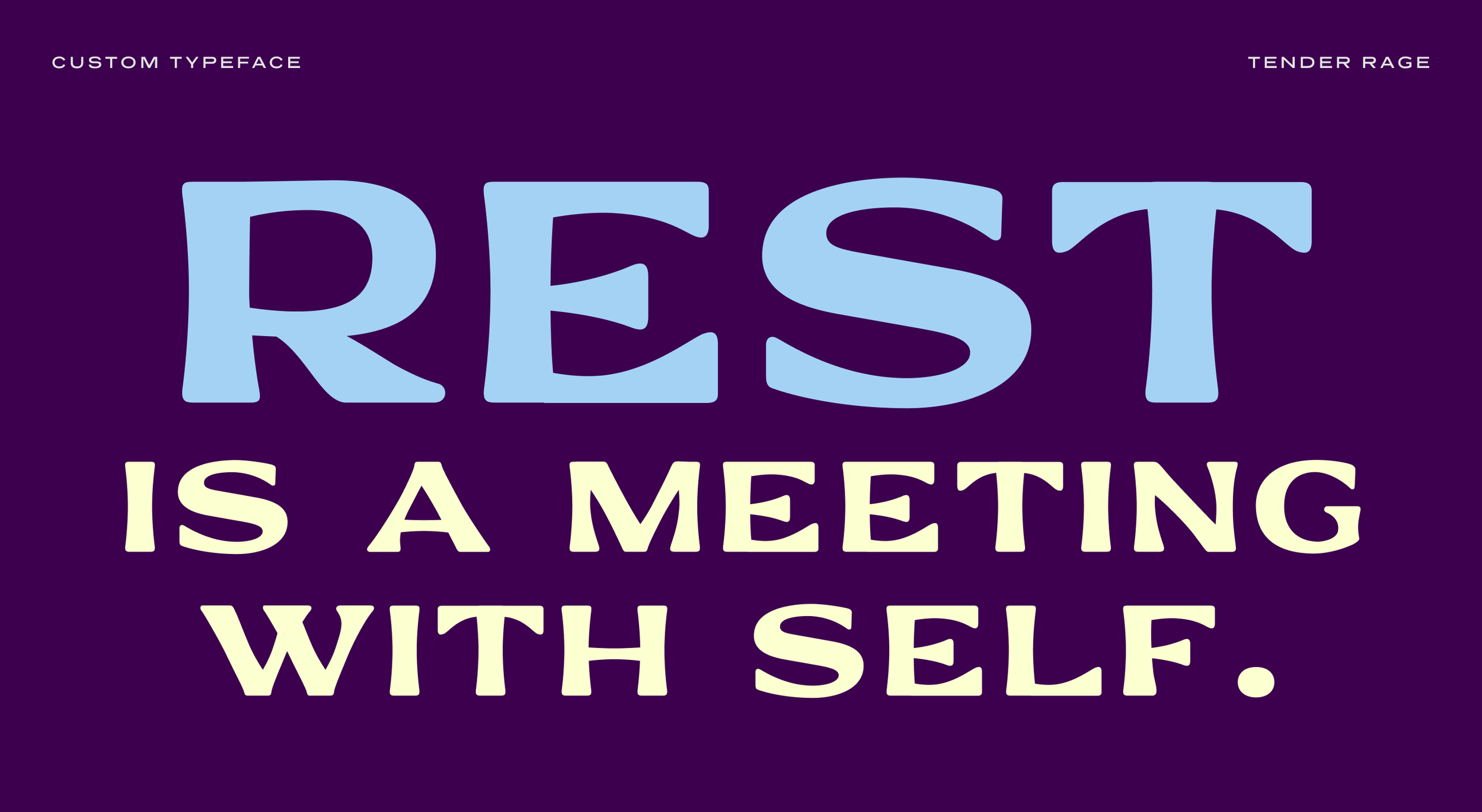
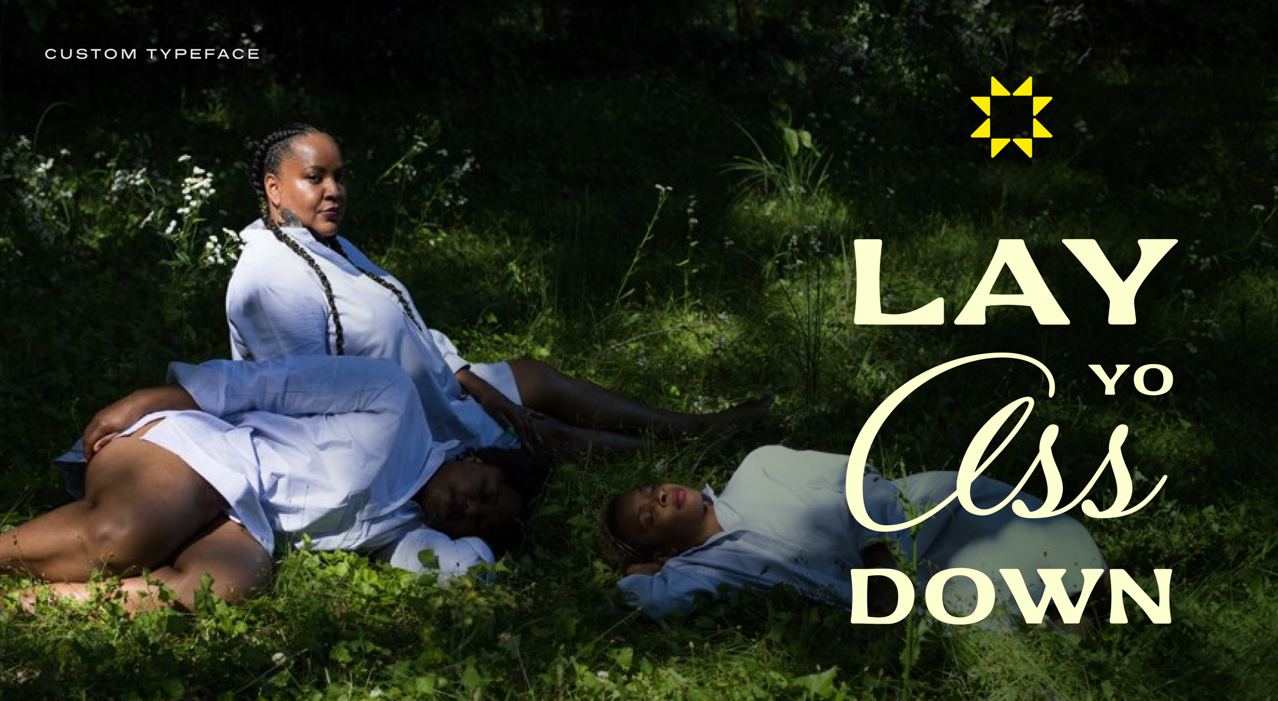
This work came out of rest. It was daydreamt and made from a space of peace, play, and ease. This work was inspired by quotes and visuals from “Rest is Resistance: A Manifesto”. This work carries napful energy, ancestral wisdom, and humor.
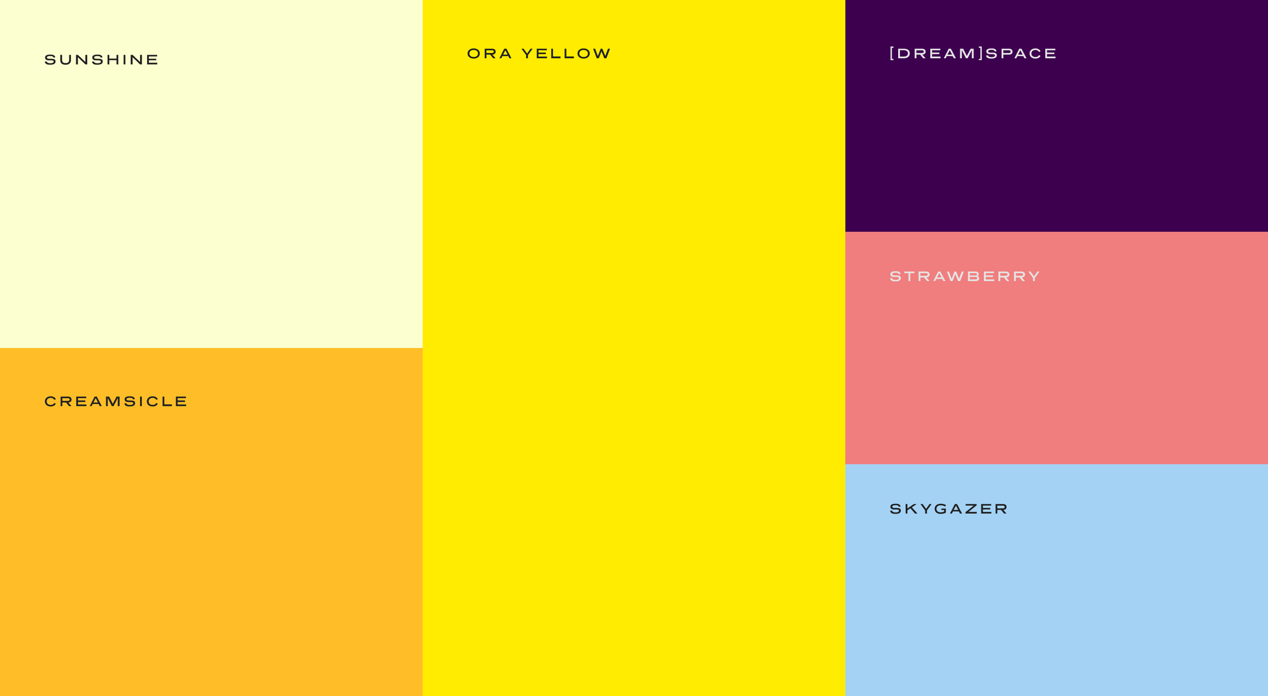
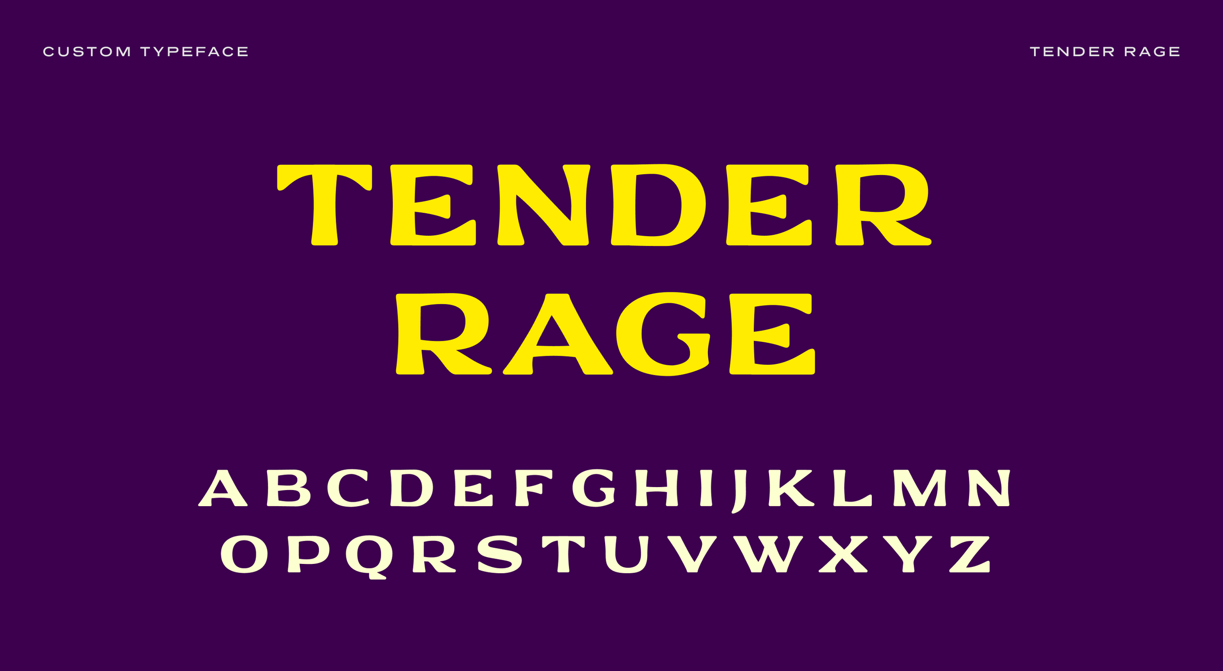
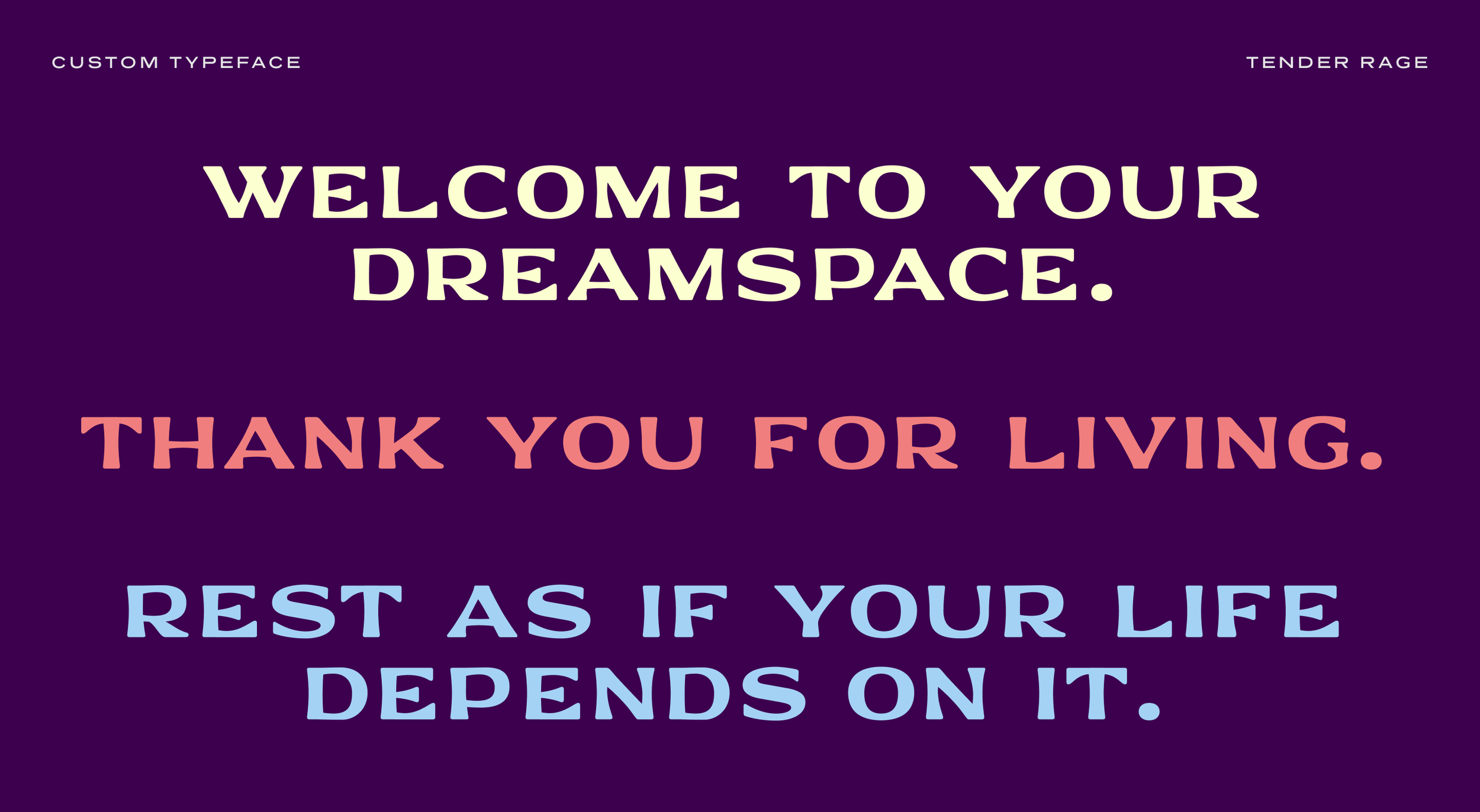
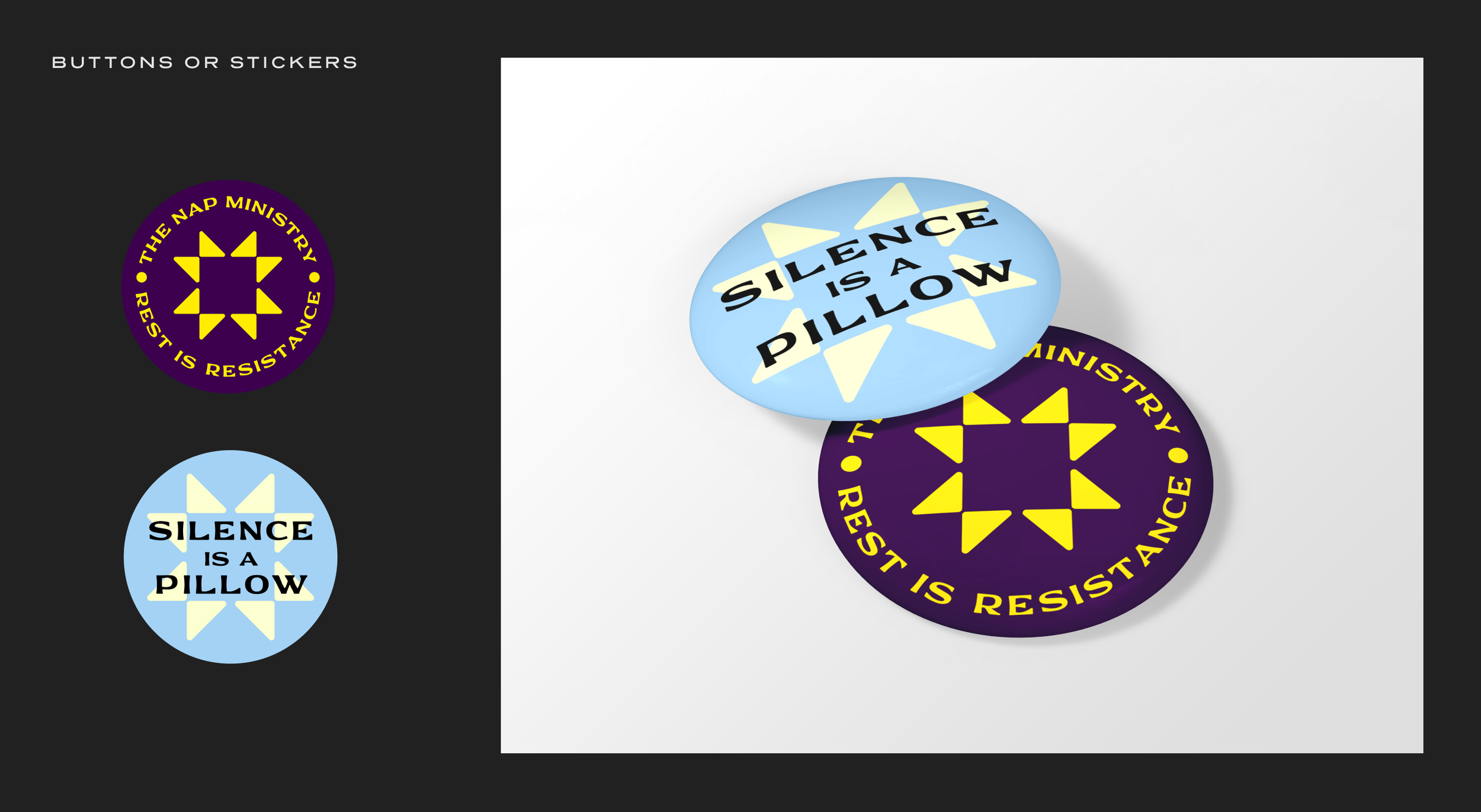
Some symbols carry forward generational power. This North Star icon is pulled from the quilts that guided Black folks travelling the Underground Railroad. Because quilts also used as bedding, this was the perfect icon for invoking our Ancestors’ ingenuity, liberation, and commitment to rest. Because of the spiritual aspects of Nap Bishop Tricia Hersey’s work, we created a custom font—FCH Tender Rage—which is inspired by old bibles where the ink would pool and soften the corners of the letters. The joyful yellow hue pulls from the existing TNM graphics, and the founder’s grandmother Ora’s yellow couch.


Logo Story
“This work came out of rest. It was daydreamt and made from a space of peace, play, and ease.”
— Schessa Garbutt, Creative Director